
Branding
The NC State brand is more than a logo. Our brand is the sum of everything we do — from solution-driven education, research and scholarship to the work that supports and sustains our efforts in the classroom and the lab.
Branding Resources
We have a shared Google Drive folder, linked below, that contains every updated branding resource that you should need. If you feel that there is a resource missing from this collection, please send us an email and we’ll see about getting this updated.
The Google Drive folder contains:
- ECE Logos
- NC State Logos
- Center Logos
- Corporate Partner logos
- Icons
- Color Swatches
- Templates
Logotype
The NC State Brick or the NC State ECE logotype should be used on all communications. The default use of the NC State ECE logotype is two-toned, with red Brick and black text. On


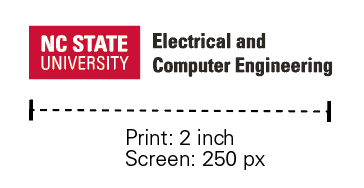
Use the appropriate size in all media, and remember to scale the logo proportionately. In print communications, ensure to use either the CMYK or Pantone versions, and do not print smaller than 2 inches in width.
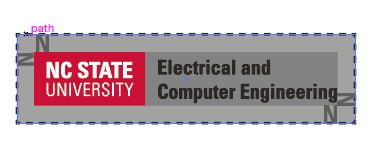
When using the NC State Brick or ECE logotype, measure the height of the letter N in NC State. Design elements, type and photos should be at least that far from the logo. The negative space surrounding the logo is considered part of the logo.
Never change the Brick’s of the ECE logotype’s aspect ratio by streching it in any direction. Neither the Brick nor the ECE logotype should ever be re-proportioned, distorted, or set on an angle.

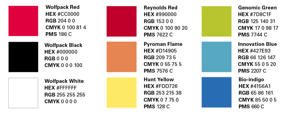
Color Palette
Typography
Our primary typeface is Univers. Within the broad family of Univers, there are four specific faces that are used predominantly: Univers Bold Condensed, Univers Condensed, Univers Roman, and Univers Light.
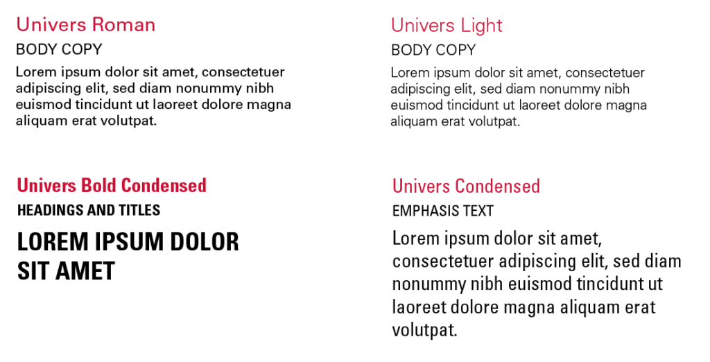
Our substitute typeface is Arial. Arial is acceptable for use in presentations, HTML emails, native applications and in Word documents that cannot be distributed as PDFs. The University has a limited number of licenses for Univers, and thus only specific roles will have access to that typeface.